Showing posts with label commercial. Show all posts
Lydia Sans
Lydia Sans Lydia SansLydia Sans


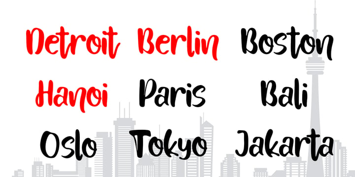
Lydia Sans™ is an elegant geometric sans serif with a charming profile and organic flow. Inspired by the clean typography of the 1920s, it's character and legibility make it suitable for any kind of text applications, from brand design to extensive text layouts.


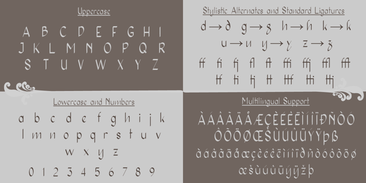
Lydia Sans™ has 22 styles, variable font technology and its weight range spreads from hairline to ultra bold forms. Flexible and adaptable, it covers 230+ languages, including extended Latin, Cyrillic and Greek writing systems. With over 1300 glyphs per style, its Opentype features include alternative shapes, small caps, standard and discretionary ligatures, localised forms in Latin and Cyrillic, case sensitive forms, numerators and denominators, proportional and tabular figures, slashed zero, fractions and more.


As a workhorse type system, Lydia Sans™ is a sans serif for everyday use and a great choice for a wide range of applications.


Suggested uses: perfect for brand design, editorial design, web design and packaging design;


22 styles: 11 weights + 11 italics.


2 variable fonts;


1315 glyphs in each weight;


OpenType features: Access All Alternates, Small Capitals From Capitals, Contextual Alternates, Case-Sensitive forms, Glyph Composition, Discretionary Ligatures, Denominators, Fractions, Standard Ligatures, Lining Figures, Localised forms, Numerators, Oldstyle Figures, Scientific Inferiors, Small Capitals, Stylistic Alternates, Stylistic Set 1, Stylistic Set 2, Stylistic Set 3, Stylistic Set 4, Stylistic Set 5, Stylistic Set 6, Stylistic Set 7, Stylistic Set 8, Subscript, Superscript, Tabular Figures, Slashed Zero;


220 languages supported (extended Latin, Cyrillic, Greek alphabets).


Weekday Mornings
Weekday Mornings Weekday MorningsWeekday Mornings


"Weekday Mornings" are the 2 first words from the song "Nancy" by Prefab Sprout. Just like the song, the font has a romantic theme and could be considered as "easy listening". Well, I've added 7 slightly different versions of each letter, enough to make the font look like the real handwriting which was the base of the font.

Fun fact: I had this song on repeat when finishing the font. I still do love that song! :)


Weekday MorningsDownload NowView Gallery


Saturday Light
Saturday Light Saturday LightSaturday Light


This font was made while listening to The Cure, and taking a trip down memory lane. However, the particular song I had in mind naming the font after, was already taken. But perhaps you can figure out which song I had in mind?


Uomo
Uomo UomoUomo


Uomo is a contemporary typographic system that explores sans geometric style and italian art deco that allows to combine four widths and three weights. Includes small caps and extras with illustrations, ornaments and words to design with no necessity of external elements. From the refined and classic to the post modern and vernacular in one only family.


-Concept, Typedesign Direction, Specimen Design & Illustrations: Miguel Hernández Montoya.

-Font Production: Tania Chacana & Miguel Hernández Montoya.


A.B.C. Founders offers not only limited sale but Permanent Popular Prices per License. The Uomo family, Tailored with Love.


Mumford
Mumford MumfordMumford


Mumford began as a revival of the early designs for sans serif fonts of the late 19th and early 20th centuries, but along the way it morphed into a reinterpretation of this style and it adaptation to more contemporary shapes.


It's strong contrast, signature of the design, works along it 9 weight variables each with their corresponding oblique. Each variable includes extended language support (+ Cyrillic), fractions, tabular figures, ligatures and opentype features.


Mumford was design with strong graphic display design in mind, perfectly suited for poster, magazine headers, titles and editorial design.


Respektable
Respektable RespektableRespektable


Respektable is random and funky ant the same time, and even though all letters are super legible, the font has this unpredictable feeling to it. Each letter has 5 different versions that vary in width and stroke weight.


Download Peanut Bite Fonts Family From PizzaDude.dk


A highly decorative and playful font, inspired doodle drawings. It has this Scandinavian vibe in a funny and lively way. If you don't fancy the decorative thingies, you can use the Regular version, which is a classic cartoonish font. The Decorative version has 4 different versions of each lowercase letter


Download Peanut Bite Fonts Family From PizzaDude.dk


Download Holgada Fonts Family From Graviton


Holgada font family has been designed for Graviton Font Foundry by Pablo Balcells in 2020. It is a geometric sans serif typeface with refined rounded endings that provide a soft and friendly appearance. Its generic shapes make it suitable for any kind of project, text length and size. Thanks to its clear legibility, it can be used in long body texts in very small sizes, in big size headlines and everything in between. The rounded endings not only provide a particular softness when used in body text, but also a distinctive touch when used in display situations such as logos and headlines.


Holgada consists of 12 styles, each containing small caps and glyph coverage for several languages.


Download Holgada Fonts Family From Graviton


Download Pasta Italiano Fonts Family From Natural Ink

Download Now
Server 1
Download Now
Server 2
Download Now
Server 3


Pasta Italiano Script is a modern calligraphy design, including Regular. This font is casual and beautiful with swash. Can be used for various purposes. such as logos, product packaging, wedding invitations, branding, headlines, signage, labels, signatures, book covers, posters, quotes, and more.


Pasta Italiano Script includes a change in the OpenType language style, binding and international support for most Western languages. To activate the OpenType Stylistic alternative, you need a program that supports OpenType features such as Adobe Illustrator CS, Adobe Indesign & CorelDraw X6-X7, Microsoft Word 2010 or newer versions. How to access all alternative characters using Adobe Illustrator:


https://www.youtube.com/watch?v=XzwjMkbB-wQ


Pasta Italiano Script is coded with PUA Unicode, which allows full access to all additional characters without having to design special software. Mac users can use the Font Book, and Windows users can use Character Map to view and copy one of the additional characters to insert into your favorite text editor / application. How to access all alternative characters, using Windows Character Map with Photoshop:


https://www.youtube.com/watch?v=Go9vacoYmBw


If you need help or have questions, please let me know. I am happy to help :) Thank you & Congratulations on Designing!


Download Pasta Italiano Fonts Family From Natural Ink


Download Pasta Italiano Fonts Family From Natural Ink


Download Blom Fonts Family From The Northern Block Ltd


Blom is a humanist sans with subtle squarish character in reverse contrast. The combination of heavy horizontals and modern geometry give the typeface a unique visual aesthetic whilst making small text perfectly readable. Blom bucks the trend of conventional letterforms in favour of a versatile typeface with bags of originality, that is both inventive in style yet completely functional in a wide range of intended uses.


Details include 463 characters, six weights with matching italics and five variations of numerals. Opentype features include inferiors, superiors, fractions, slashed zeros, case-sensitive forms, ligatures and language support covering Western, South and Central Europe.


Download Blom Fonts Family From The Northern Block Ltd


Download Tasty Joke Fonts Family From PizzaDude.dk


Tasty Joke was made with a slightly bulgy pen, and by using a loose touch.The result: two fine kinds of naive and lively letters. Combine the Regular and Line versions for cool results.


Download Tasty Joke Fonts Family From PizzaDude.dk


Download Logik Fonts Family From Paulo Goode
Download Logik Fonts Family From Paulo Goode Download Logik Fonts Family From Paulo GoodeDownload Logik Fonts Family From Paulo Goode


Logik is a futuristic square sans serif typeface. Its personality is defined by squared-off corners that you would normally expect to be rounded, this sharpness gives the glyphs an eccentricity that the eye quickly adjusts to. Sharp, incised/stylised ink traps along with slightly tapered/curved horizontals and verticals add to the character of each letterform. These subtleties combine to give Logik a distinctively futuristic aura. Logik’s main use would be for headlines, short runs of text, branding and display purposes – ideally suited for film and book titles, Logik could be widely used for sports, media and recreation purposes also.


Logik comes in 7 weights (from Thin to Black) across 3 widths – Regular, Wide, and Extended. Each font covers all European Latin-based languages and includes Old Style Figures, Small Caps, and some Case-Sensitive Forms. 


Key features:

  • 7 Weights in Roman and Oblique
  • 3 Widths – Regular, Wide, Extended
  • Small Caps
  • Old Style Figures
  • European Language Support (Latin)
  • 550+ glyphs per font.


Download Logik Fonts Family From Paulo GoodeDownload NowView Gallery


Download Unlikely Fonts Family From PizzaDude.dk


This all started as a bunch of letter written using a squared paper as a guide. It all turned out fine, but there was something that wasn't quite right...it was boring! I took all the letters and grunge it all up and did all the drips as well - and suddenly that boring look was gone!

That was an unlikely development!


Download Unlikely Fonts Family From PizzaDude.dk


Download Primitivus Fonts Family From PizzaDude.dk
Download Primitivus Fonts Family From PizzaDude.dk Download Primitivus Fonts Family From PizzaDude.dkDownload Primitivus Fonts Family From PizzaDude.dk


It all started with making of a simple all-caps font. I drew the whole alphabet, numbers all else needed - but something wasn't quite right...the lettershapes were fine, but quite boring. Then I took a drastic decision: I started all over again ... meaning, I printed the whole thing, messed it up using a wet cloth and wrinkled the paper - then scanned it all again, and imported all the graphics yet again. A lot of work, yes - but personally I think it was worth it! But anyway, that's the story of how Primitivus was made ... well, almost, but not quite ... but that's another story!


Use Primitivus for anything that needs that special kind of look were handdrawn letters meets grunge! Play around with the 4 different versions of each letter to make your text look even more random and natural!


Download Primitivus Fonts Family From PizzaDude.dkDownload NowView Gallery


Download Paper Sting Stencil Fonts Family From PizzaDude.dk
Download Paper Sting Stencil Fonts Family From PizzaDude.dk Download Paper Sting Stencil Fonts Family From PizzaDude.dkDownload Paper Sting Stencil Fonts Family From PizzaDude.dk


I made Paper Sting using an inky pen. There is a great variation in the stroke width, which gives a very lively handmade feeling. Paper Sting comes in two versions: Regular and Stencil - mix them for cool realistic results. Of course there is multi-lingual support as well as contextual alternates, which means 5 different versions of each letter.


Download Paper Sting Stencil Fonts Family From PizzaDude.dkDownload NowView Gallery